
Бесплатный фрагмент - Advertising design
10 illustrated lessons
Foreword
The “advertising design” course consists of 10 illustrated lessons and is meant to give you the specific visual language of an advertising message.
The course is based on the visual semantics — a sign and sign compositions. There’re figurative, geometric, font signs and trademarks (logos). We work with signs in different ways to create a good figurative advertising message, using such terms as plasticity, trajectory, phrase, etc. We realize that while creating a composition, the main goal is to find the way to promote goods, services and trademarks.
The course is interesting and entertaining, thanks to the set goal, using your own prepared stuff, such as photos, formal text, trademarks, and also, thanks to an opportunity to analyze similar works and rate students’ work examples.
We use CorelDRAW or Adobe Illustrator, also Photoshop if necessary.
Students’ advertising compositions are aimed at visual research and are abstractly characterized, the text contains zero information.


Unit 1. Sign
A figurative sign is used as the advertised object, a trademark is used to represent the advertiser (brand).
We carefully study the way figurative signs and trademarks are formed, we learn to create quite a simple visual text. The dominant in the advertising message is a figurative sign.
In this unit we learn to work with similar works, create sign combinations correlated in plasticity, create trajectories and phrases, use various expressive means, match the image.
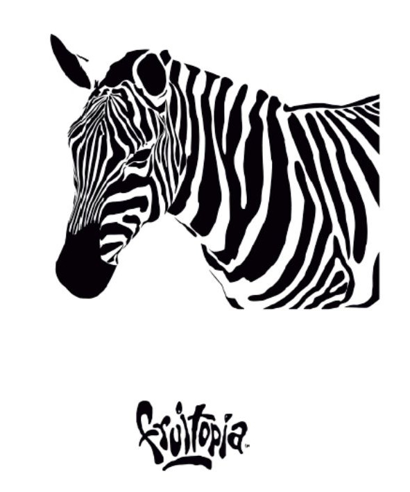
Trademark
First of all, we should know the definition of trademarks.
Trademark — a stylized beautiful graphic image identifying exactly an object, company or its specific activity. It’s registered and marked as R, if the trademark is still being registered — TM.
Figurative trademark — a graphic image of an object or its parts, geometric shapes or figures, it’s semantically charged.
Verbal trademark — a graphic font image used to identify only one specific company or goods, it contains no figurative elements (it includes logos and abbreviations).
Logo (abbreviation of logotype, from Greek: logos “word”, typos — “imprint”) — a verbal graphic original image, sometimes with figurative elements.
Abbreviation — a graphic image of the first letters of word phrases.
Combined trademark — a whole composition consisting of figurative and font trademarks.
Content for the lessons
Prepare figurative, geometric, font signs and trademarks for your individual work. You may download signs on the Internet. Figurative signs are placed on a white background, sometimes, on a transparent background. Try to make your content beautiful, expressive, quality, so it’d be interesting and fun to work with this “building material”. Remember about the repetition of similar colors (black, red, blue), what we often call “support”. It’s desirable that the text be topic-neutral and in a foreign language.
Study the following:
— file extensions JPG and PNG;
— resolution of 72, 100, 300 DPI;
— RGB, CMYK color models.
Lesson 1. Types of signs
The goal is to study the way signs are formed.
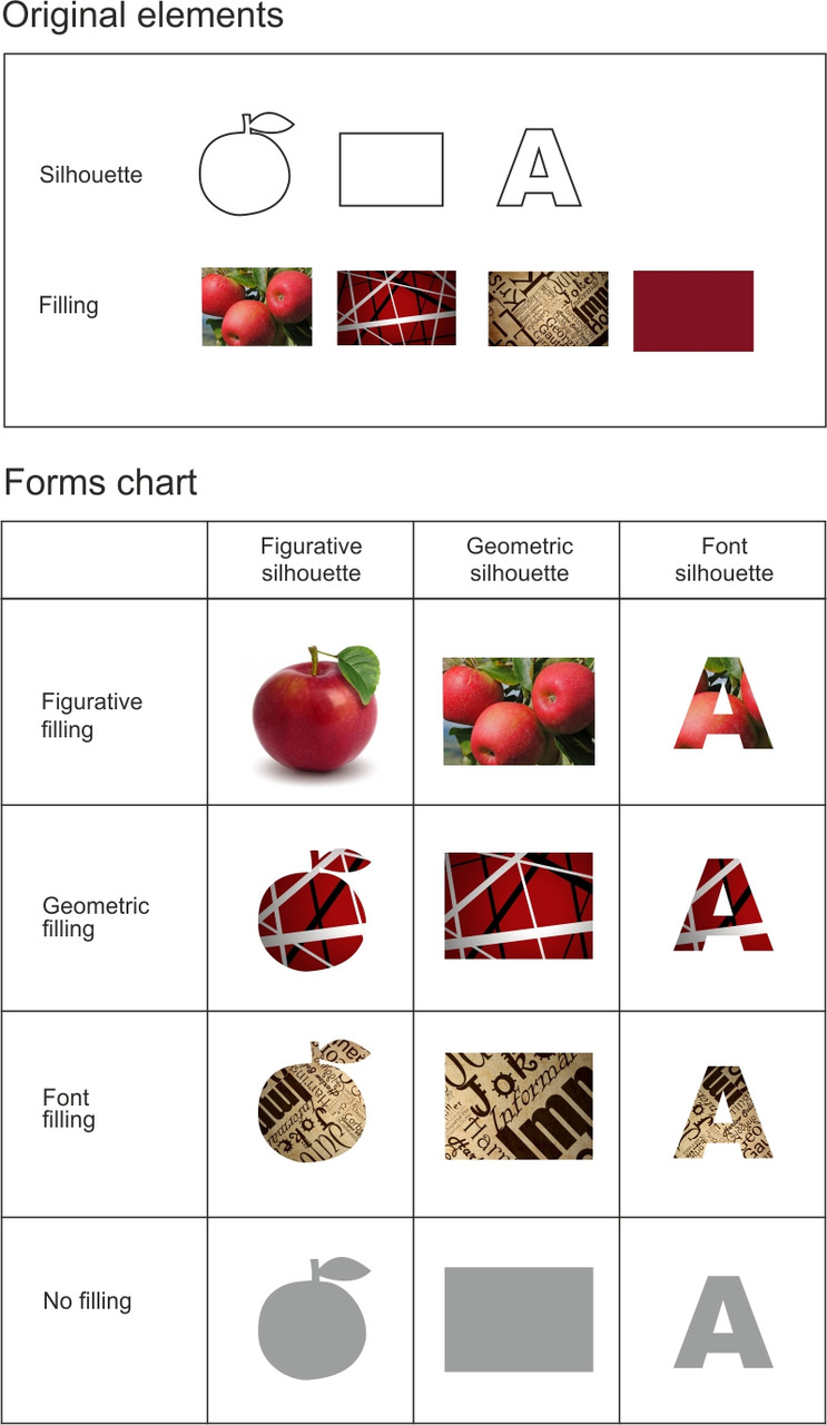
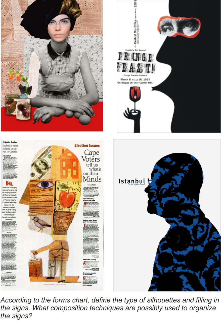
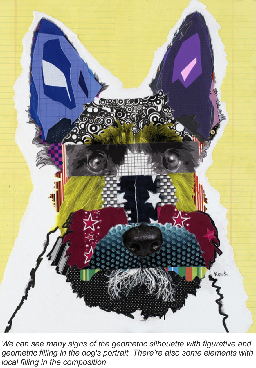
The task is to create a composition with various sign forms from the viewpoint of silhouette and filling.
Sign — an imaginary object used to signify another object (agreed upon).
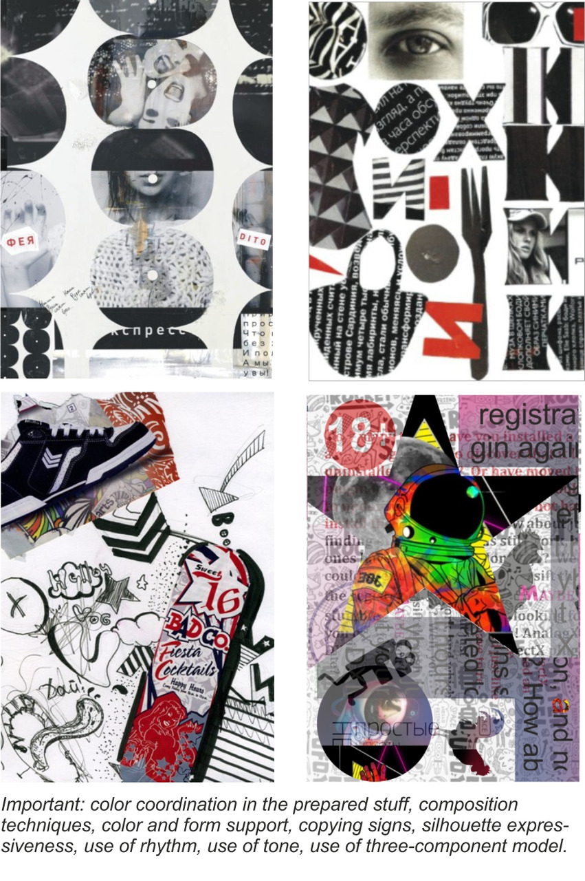
We create linear silhouettes of figurative, geometric, font signs. We take photos with different filling. By means of these forms and an ability to cut out objects, we create our forms chart. Then we work with the composition using various expressive means, such as rhythm, tone, color support, three-component model (large, average, small), etc.

Lesson 2. Plasticity
The goal is to learn to coordinate the elements of an advertising message from the viewpoint of plasticity.
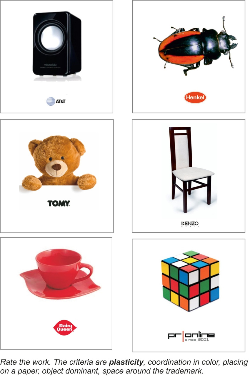
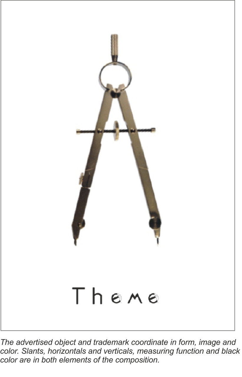
The task is to create the coordination between the advertised figurative sign and trademark from the viewpoint of plasticity.
Plasticity — the art of creating various perfect and harmonious forms.
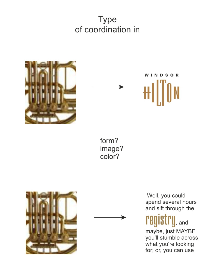
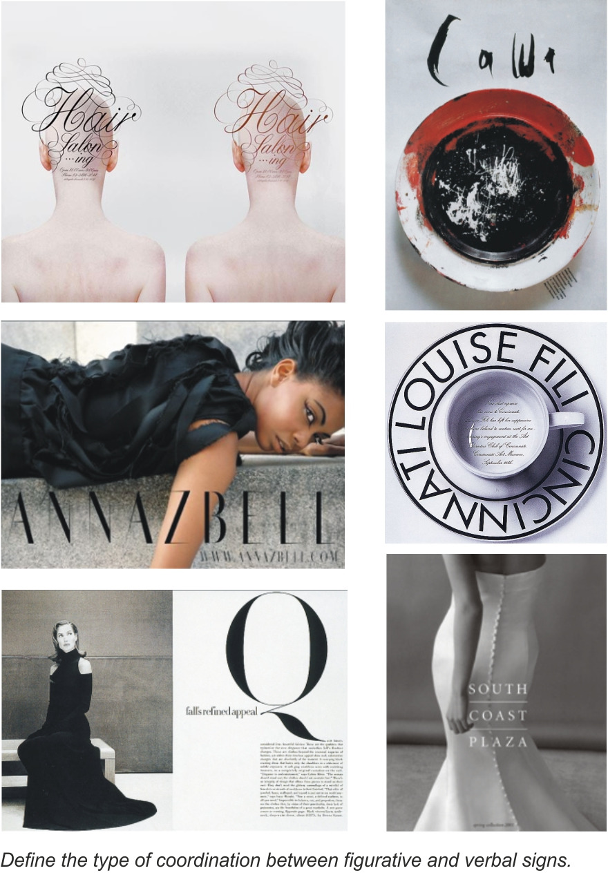
We carefully study the form of the figurative sign, its silhouette, rhythm, plasticity, color, and also image and associations. All this should coincide with the trademark form, and, sometimes, have support in the font signs. We place the signs on the work plane, where the figurative sign as an advertised object dominates.
We learn:
— to copy;
— to turn;
— to reflect horizontally, vertically;
— to place on the background;
— to distinguish between raster images and vector images;
— to use a color picker.

Lesson 3. Trajectory
The goal is to learn to create a trajectory in an advertising message.
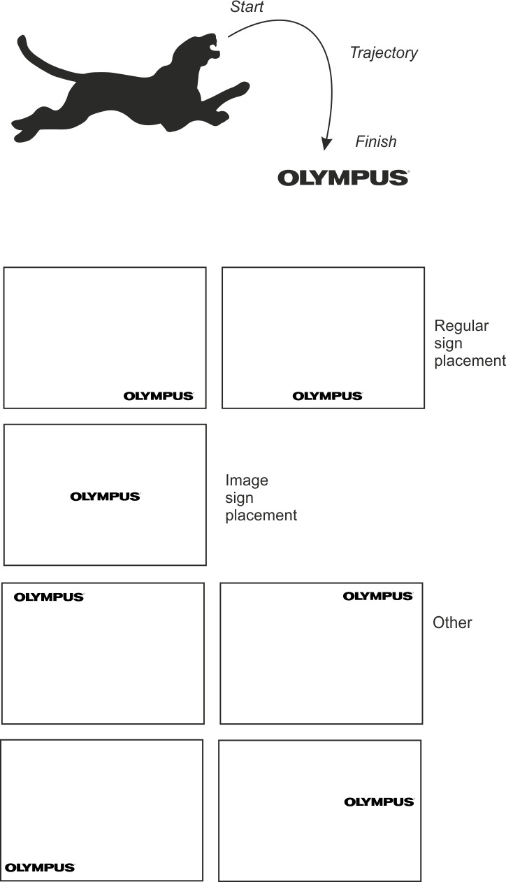
The task is to create a trajectory from the figurative sign to the trademark.
Trajectory — a continuous path along which your gaze moves.
Gaze — a long steady look.
Your gaze easily moves from the figurative sign (advertised object) to the trademark either by means of text or without it. We use a very simple text form so far — a line or a few lines.
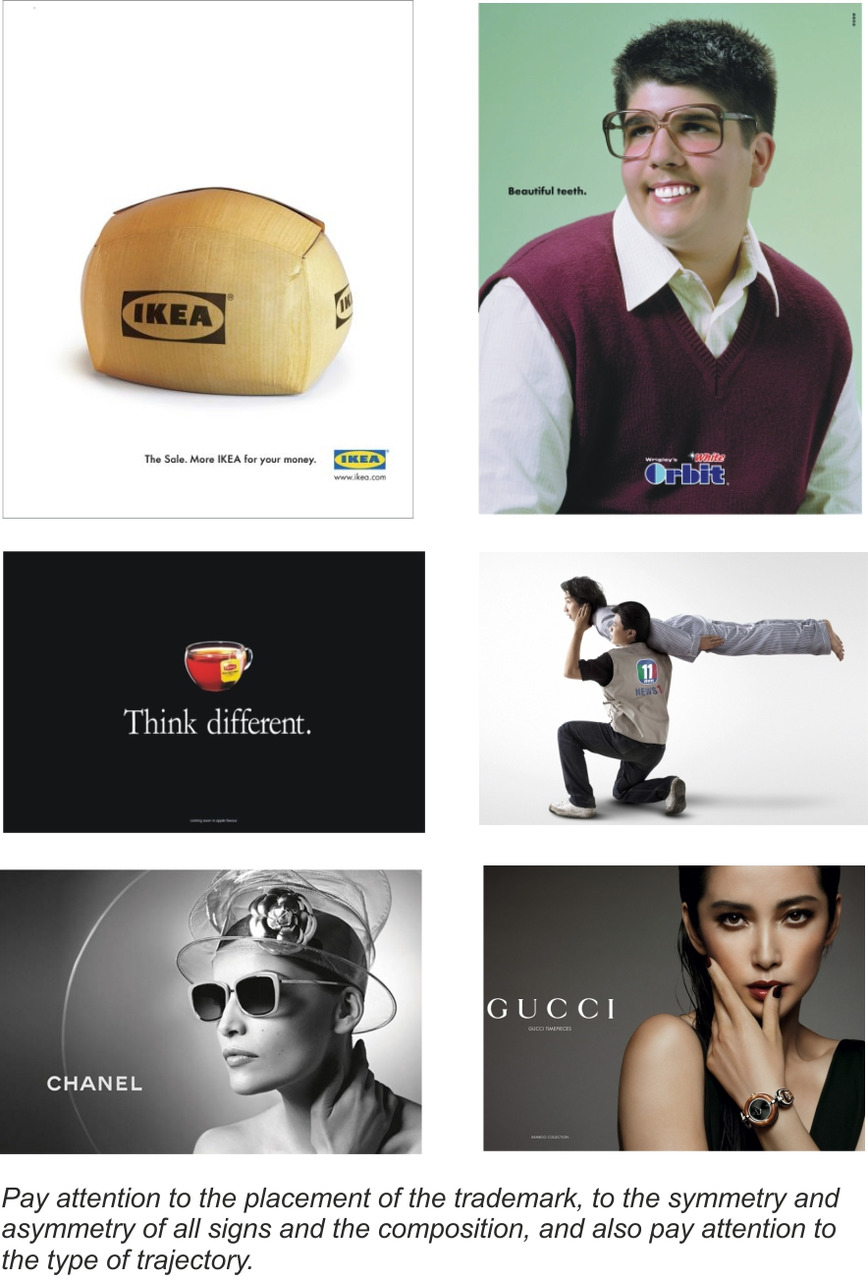
The trademark location on the work plane has its specific psychological perception peculiarities. Trademarks are normally placed at the bottom right or bottom middle. At the bottom right your gaze more easily moves beyond the plane capturing the trademark. At the bottom middle your gaze moves beyond the plane symmetrically, so this proves that the advertising situation is stable, firm. The trademark size is normally not large, so the brand is marginal and modest.
Бесплатный фрагмент закончился.
Купите книгу, чтобы продолжить чтение.
